Work
Latest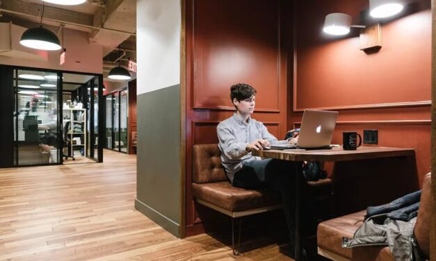
Integrating AI in Coworking Spaces: Enhancing Collaboration and Efficiency
Explore the practical applications of artificial intelligence at coworking spaces, including the subtle shifts and exciting future possibilities.


Play
Latest
Ranking the World’s Fastest (& Slowest) Internet Speeds
Have you ever wondered which countries have the fastest, and slowest, internet speeds? Before you book your next coworking destination, it may be worth taking a look at the locations with the speediest download and upload times.


Spaces
Latest
The Rise of Rural Coworking Spaces: Fostering Local Talent in Small Towns
Rural coworking spaces are turning empty buildings into community centers, giving locals and transplants a reason to stay, create, and thrive.


Trending this week

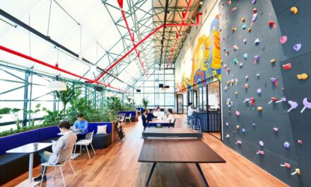
Coworking’s New Role: Building Stronger Niche Professional Communities
Learn why niche coworking spaces offer a blueprint for how physical workspaces can adapt to meet the diverse demands of professional communities.


Faces
Latest
Craft Your Content Episode #42: Writers’ Rough Drafts – Mason Currey
This episode first appeared on Craft Your Content. You can listen to more episodes of Writers’...


Places
Latest
Working On the Go: 7 Last-Minute Coworking Spaces To Check Out in London
Next time you're in London, check out one of these 7 coworking spaces to boost your productivity, connectivity, and enjoyment of the city.


Happenings
Latest
Join the Webinar Tomorrow: How to Automate Access to Your Coworking Space
On August 1, experts from Kisi and Spacebring will tackle the most time-consuming hassle for coworking owners: managing access control.